Blend Sip Smile
Nestled in the heart of Goa, Tesouro Wines is your gateway to a world of exquisite flavors and rich traditions. At Tesouro, every bottle is a treasure waiting to be discovered, crafted with passion and perfected with time. Join us for a sip and savor the essence of Goa in every glass.
Project Overview:
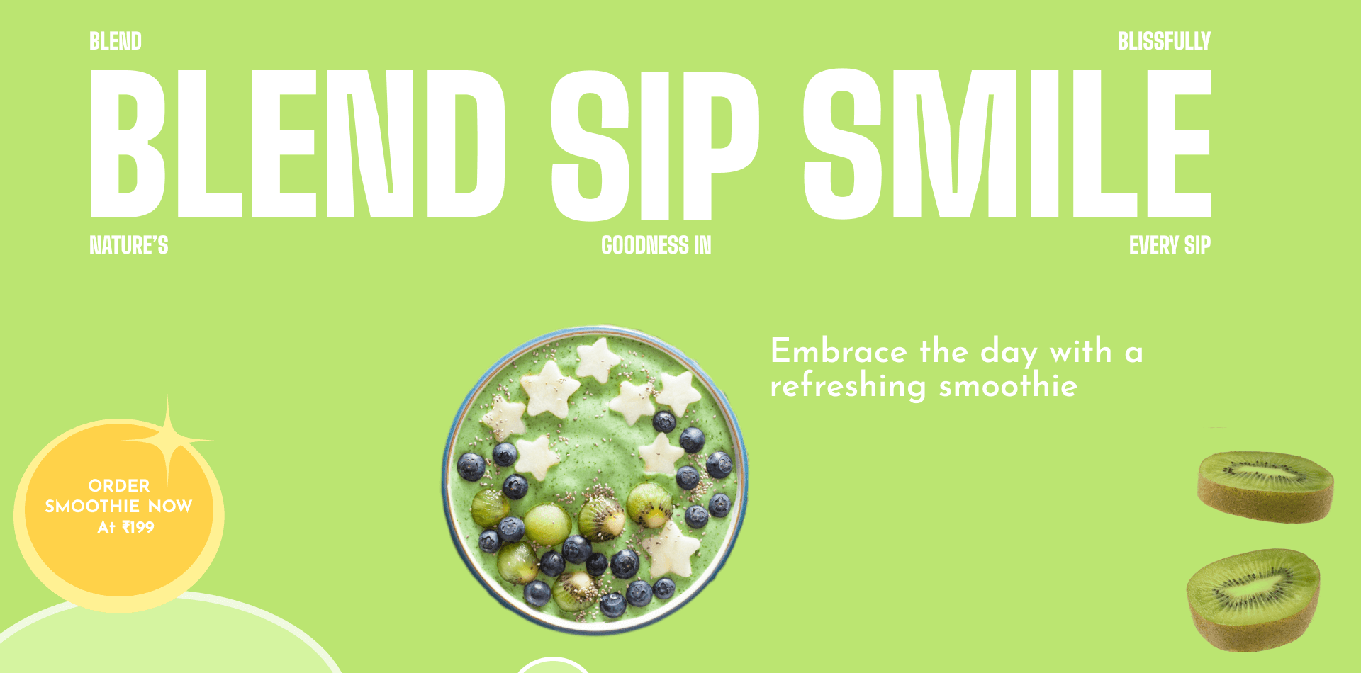
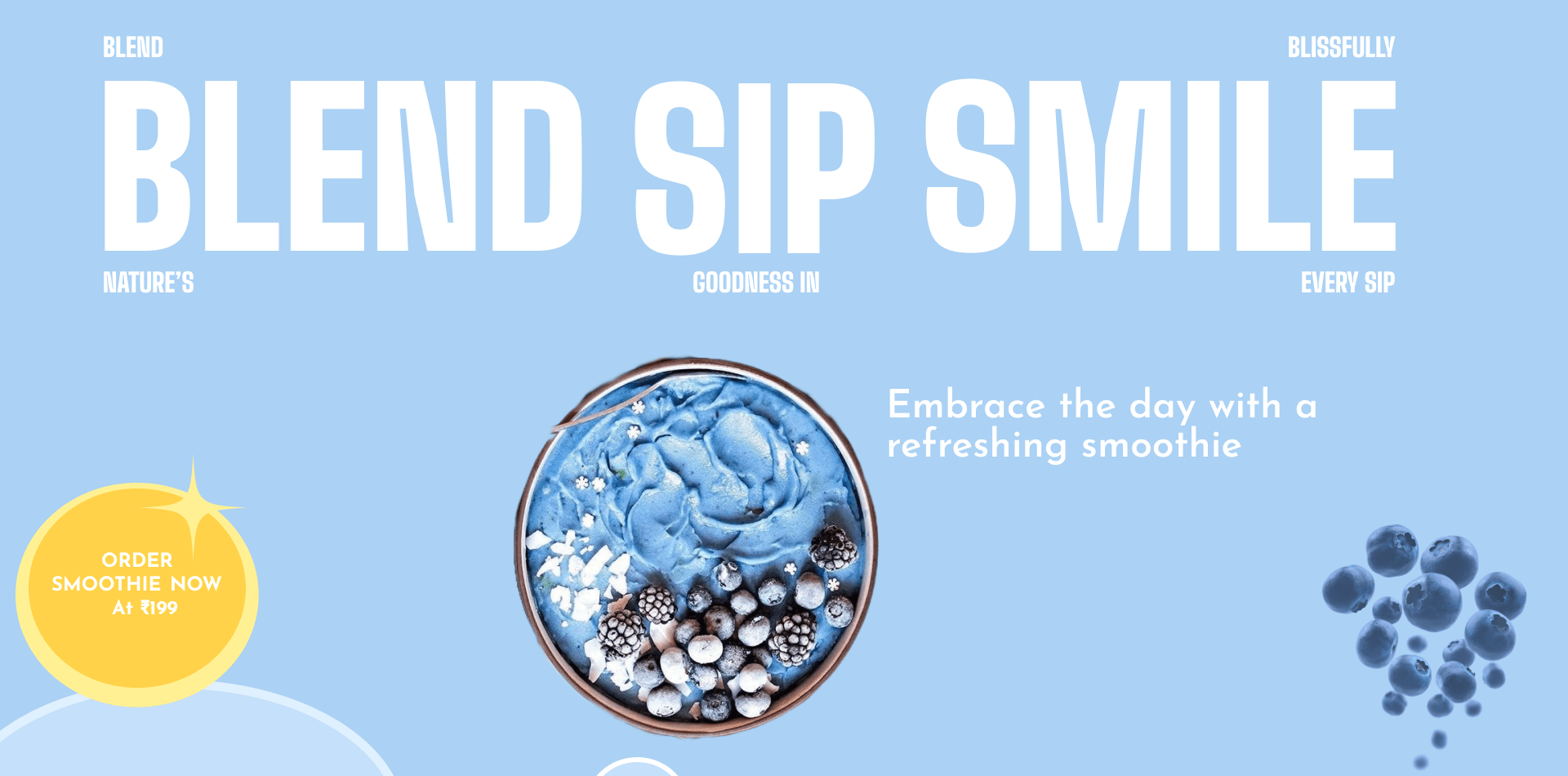
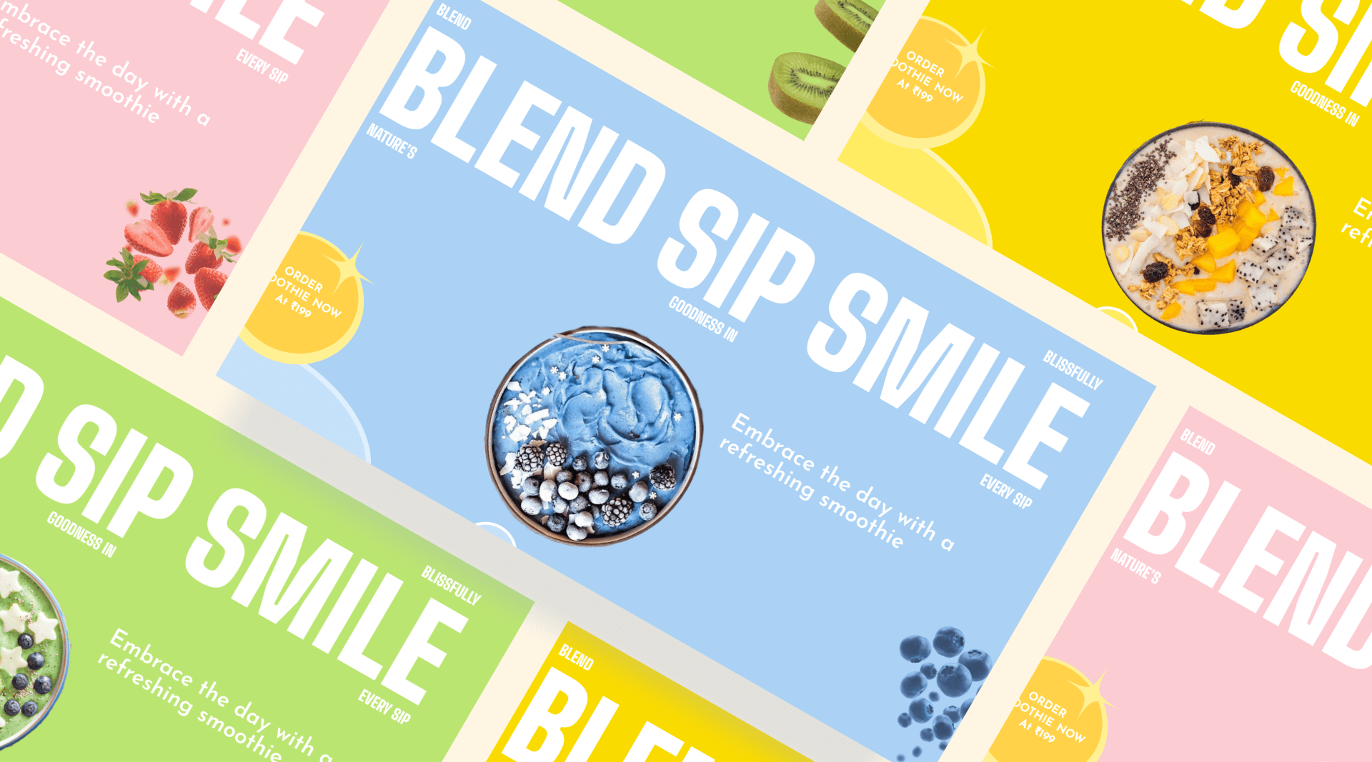
The goal was to design an engaging and vibrant hero section for a smoothie brand's website that would immediately attract visitors, convey the brand's essence, and encourage conversions.
Role:
Product Designer
Tools Used:
Figma, Adobe Photoshop,
Adobe Illustrator
Duration:
10 Days
Challenges:
- Balancing Visual Appeal and Functionality: Ensuring the hero section was both visually striking and easy to navigate.
- Responsive Design: Adapting the design for different screen sizes while maintaining its impact and readability.
- Content Placement: Strategically placing call-to-action buttons and text to guide users effectively without overwhelming them.
Design Development
- Color Scheme: Chose a palette dominated by soft pinks and bright, fruity colors to evoke freshness and health.
- Typography: Selected bold, clean fonts to ensure readability and impact.
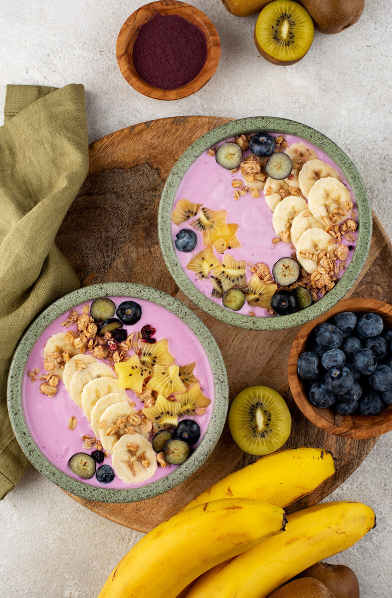
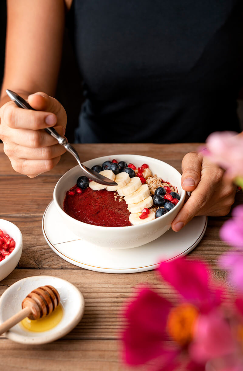
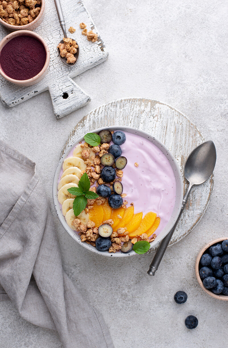
- Imagery: Incorporated high-quality images of smoothies and fresh fruits to make the design visually appealing.
Research and Inspiration:
Market Analysis: Analyzed various smoothie and health food brands to understand common visual
themes and user expectations.
User Personas: Created personas to identify target audience preferences, focusing on
health-conscious individuals and smoothie enthusiasts.
Analysis:
Peer Review: Collected feedback from peers and mentors to identify strengths and areas for improvement.
Usability Testing: Conducted informal usability testing to evaluate the design's effectiveness and user
experience.
Enhanced Visual Appeal: Refined the color palette and typography to create a cohesive and luxurious
look.
Improved Navigation: Simplified the navigation to ensure users can easily access information about
the wines, the brand story, customer testimonials, and events.
Engaging Content: Highlighted key wines, the brand's heritage, and customer testimonials in a
visually appealing manner to captivate visitors.
Conclusion:
The final design successfully captured the essence of the smoothie brand, offering a vibrant and
engaging hero section that appeals to health-conscious users. The project highlighted the importance
of balancing aesthetics with functionality and provided valuable insights into user-centered design
practices.
Visuals:
This project allowed me to explore the intersection of design and health
branding, reinforcing
the
significance of user research and iterative testing in creating effective web designs. The
positive user
feedback and predicted performance metrics validate the design choices, making this a noteworthy
addition to my portfolio.
NEXT CASE STUDY